
Key Takeaways
- Complementary colors create high contrast and visual energy when paired together.
- Analogous color schemes - colors sitting next to each other on the wheel - produce naturally harmonious outfits.
- Neutral colors anchor bold combinations and allow statement pieces to read clearly.
- Tone and saturation matter as much as hue - muted versions of complementary colors look sophisticated, not jarring.
- Understanding why a combination works helps you replicate the logic across different pieces and seasons.
Color Theory in Fashion
Color theory is a set of principles that explains how colors relate to one another and how the human eye perceives them together. In fashion, it provides a framework for choosing combinations that feel balanced, intentional, and visually pleasing rather than accidental. You don't need an art degree to use it - the core ideas are straightforward and immediately applicable to everyday dressing.
Color relationships are often described using a color wheel, where hues are arranged by their spectral relationship. Complementary colors sit opposite each other; analogous colors sit adjacent. These positions predict how colors will interact visually.
The Logic Behind Color Pairings
Most people learn color rules by accident - through trial, error, and the occasional regrettable outfit. But there's actual structure behind why certain combinations work, and understanding it replaces guesswork with a repeatable approach.
The color wheel organizes hues by their relationships. Colors directly across from each other are called complementary; they create the highest contrast and the most visual energy. Think of deep purple paired with golden yellow, or teal with terra cotta. These pairings feel bold and deliberate because your eye naturally perceives the contrast between opposites.
Colors that sit side by side on the wheel are called analogous. Green, blue-green, and blue form an analogous group. These combinations feel calm and cohesive because the colors share underlying pigment. They're the easiest pairings to wear because they rarely clash.
A third structure - the triadic scheme - uses three colors evenly spaced on the wheel. It's more complex but offers balanced variety. Red, yellow, and blue is the classic triad; in fashion, this works best when one color dominates and the others serve as accents.
If your outfits regularly feel unresolved, understanding what pulls a look together is a useful companion to color logic.
Tone and Saturation: The Variables That Actually Decide Everything
Knowing which colors relate to each other on the wheel is only half the picture. The other half is tone - how light, dark, or muted a color is. Two complementary colors at full saturation can look aggressive. The same pair in dusty, muted versions reads as sophisticated.
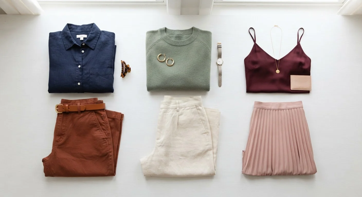
Sage green and dusty rose, for example, are near-complementary. At full saturation - lime and hot pink - the same relationship becomes loud. The hue relationship is identical; the tone is everything.
Test Saturation Before Combining Colors
Before pairing two colors, hold the pieces near each other in natural light and check whether they share a similar intensity. If one looks washed out next to the other, the saturation levels are mismatched. Pieces with similar tonal depth almost always work better together, regardless of where the colors sit on the wheel.
This is why premium-looking wardrobes tend to favor muted, tonal palettes. It's not that bold colors are wrong - it's that uncontrolled saturation across multiple pieces competes for attention. Choosing pieces with consistent saturation levels, even across different hues, creates a sense of visual cohesion.
The same principle applies to warm and cool undertones. A warm olive and a cool charcoal can coexist if the saturation levels are similar. Where combinations go wrong is often in undertone mismatch - combining a yellow-based beige with a pink-based beige, for instance, creates subtle friction the eye notices even if the wearer can't name it.
Neutrals Are Not Afterthoughts
Black, white, grey, camel, and navy function as anchors in any palette. They don't appear on the color wheel, but they interact with every color on it - and their role is to give the eye somewhere to rest.
A strong complementary pairing - cobalt blue and burnt orange - becomes easier to wear when one of those colors is expressed as a small accent and a neutral carries the bulk of the outfit. The color relationship still reads; the neutral just keeps it from feeling overwhelming.
90%
Of snap judgments about products attributed to color alone
Research published in the journal Management Decision suggests color accounts for a substantial share of initial visual impressions in consumer contexts.
3
Maximum colors recommended in a single outfit palette
A widely used guideline among stylists suggests limiting an outfit to three colors - one dominant, one secondary, one accent - to maintain visual clarity.
Black is often treated as a default neutral, but navy, stone, and warm brown work just as effectively - and in some pairings, more elegantly. The right neutral depends on the undertones of the colors it's anchoring.
Fit plays a significant role in how color combinations read - well-fitted pieces allow color to work as intended without distraction from excess fabric or poor proportion.
Practical Combinations Worth Knowing
Translating theory into real outfits means identifying a handful of reliable pairings and understanding why they work - so you can adapt them as your wardrobe evolves.
The underlying principle in each of these is consistency: consistent tone, consistent saturation, and a clear sense of which color leads and which supports. Proportion and silhouette interact with color balance too - how much of each color appears in an outfit changes how the combination reads overall.
Color theory doesn't require memorizing the wheel. It requires noticing patterns - why a combination feels right or off - and applying that awareness the next time you get dressed.